

How to make homemade hummus

Herbs in the Bathroom

vida e caffe Competition - Long live the Bean

The concept was derived from their company philosophy, one of the things they mentioned on their mission statement was "a shrine for the wonderful bean...".

Creative Review - Letterpress

Check out our letterpress section and contact us for super South African letterpress sales.
Homemade muesli - so much better...

3 cups Oats
1 1/2 cups Nuts, like peanuts, pecans, walnuts etc
1 1/2 cups Seeds, like sunflower or pumpkin etc
1 cup Raisins or any other dried fruit
1/3 cup Honey
1/3 cup Vegetable Oil
1 tsp Cinnamon
How to do it:
1. Preheat oven to 140C
2. Mix all you dry stuff together in a bowl.
3. Mix honey and oil in a separate bowl.
4. Add the honey and oil mixture to the dry stuff, mix together.
5. Transfer onto a baking tray and bake in the oven for about 45 min or until golden brown... Stir every 10 min or so.
6. Let cool before transferring into a jar or container.
Willy:s paper bag


The recycle/reuse philosophy definitely runs in the family, as Ida's mum wrapped the parcel in this recycled paper bag (Willy's is a food shop in Sweden). It now has a proud place up on our notice board in the office.
PS we think the extra bold serif typeface rocks, looks so similar to the Egyptian Slate we use.

Deep Dark Africa shopping site is live!

Check out this new lovely online shop!! We had the privilege in designing Lexis corporate identity, so happy to see it come to life! Come on peeps, get shopping!
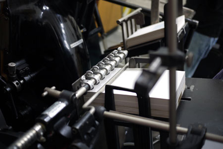
Friday Special - The Wonderful Sense(s) of Letterpress


We will be selling these soon, watch this space!


More pics available for viewing pleasure on the letterpress section on our website.
We also made a pretty rudimentary video to highlight one of the senses, in particular sound, give it a watch or should we say listen.
If you are interested in introducing letterpress to your company's stationery, looking for a unique wedding invitation, an exclusive coaster for your bar, or anything else you can think of, drop us a line. We would love to make a piece of art just for you!
VonZipper Superheat Artwork Comp


They asked for something fresh and different, so we went with a retro-ish style, particularly on the flames with a combination of illustration and typographic layout. Check out the comp here and to see last years winning entry.
The Innovation Summit


We put on our thinking hats for this one... Really excited to be part of this project. The Innovation Summit is held in Johannesburg from 30th of August to 1st of September this year, and we had the privilege in designing the advert, banner, e-newsletter, and double sided postcard for this event.


The postcard we designed wouldn't have looked the same if it wasn't for Jess from Shelflife (an amazing shop in Australia, wish we lived closer!) and her talented brother and illustrator Rob from The Avocado Moshpit, who took the photo of the blackboard wall in Jess's shop. Thanks guys for being so helpful and allowing us to use the photo!
The Wacky Wine Festival


Was quite a busy weekend for us. We were visiting clients in Swellendam (see below the work we've done so far for the innovation summit), but not all work, also pleasure! The Wacky Wine Festival was on and we were sure to enjoy it! Had such a good time exploring the local wines, foods and the walks in the country side. Ah, fresh air and quietness... Check out Flickr and Tumblr for more pics.

 It might help to embed your inner monster in a bed of flowers...
Stig Lindberg, our hero

Photographer Mojo

More templates to follow but they won't be free forever so grab em while you have the chance.
A little bit about the Mojo... "Photographer Mojo is all about YOU, the photographer. It is our vision to become the online home for photographers who seek advice, inspiration and tools to not only become better at their craft, but also be equipped with the resources that will make them successful entrepreneurs running a profitable photography business."
Our portfolio - a short story

It's A3 and landscape in format; printed on Opale Pure White 150gsm paper that is super smooth to touch. It comes from France and best of all is that the entire Opale range is environmentally friendly.
Now, now let's not get too carried away on the paper though, we've also have to mention the book that the pages sit in. It's a 4-screw post book, just a tad bigger than A3 format to allow the pages to sit nice and comfy within. The book is covered in grey Wibalin on the exterior and white on the interior. It was hand crafted by a superb bookbinder by the name of Peter, what a gent and a true perfectionist. We like those kinda people; he takes his job seriously and with 30 years behind him, surely knows his trade. The portfolio also bears our company logo neatly debossed in the centre of the book. I'll explain this part with the accompanying images below.


Subscribe to:
Posts (Atom)